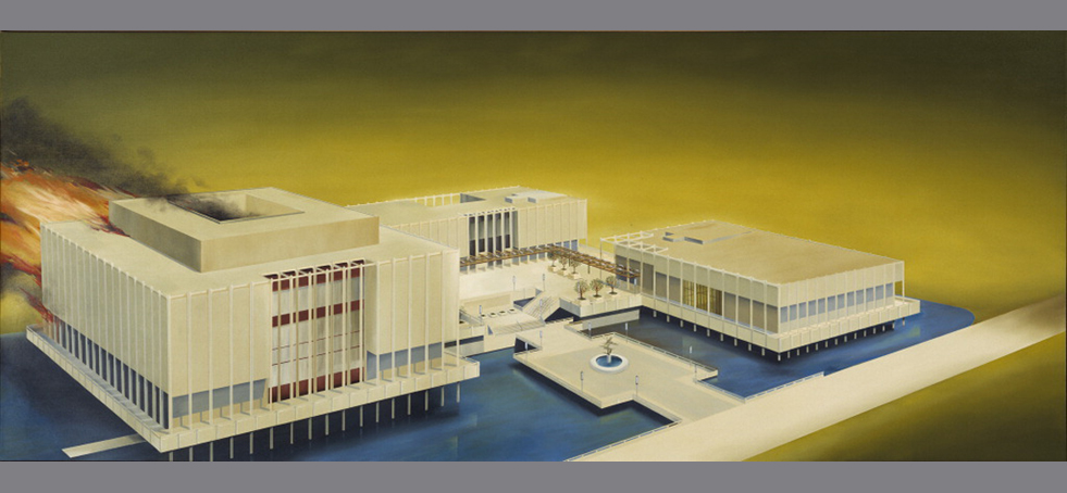
PST Home
 
< BACK TO EXHIBITIONS
left arrow right arrow
  • Standard Station, Amarillo, Texas (1963 )

    Ed Ruscha

    Standard Station, Amarillo, Texas submits a generic “standard” example of roadside architecture to emphatic frontal treatment, and it condenses pictorial elements to the register of design. Included in Ruscha’s second solo exhibition at Ferus, in 1964, the painting is based on a photograph in his first artist’s book, Twentysix Gasoline Stations (1962). The source image is monumentalized by the transposition to oil on canvas, in particular by the addition of the three klieg-light-like beams. A plunging upper-left-to-lower-right diagonal, one of Ruscha’s formal trademarks, divides the canvas, but the device (which, like the use of stark primary contrasts and pristine, architectonic depiction, is a testament to a background in graphic design and advertising) is less an effectuation of perspective than an elementary illusion of how to render it.


    Oil on canvas 64 1/2 x 121 3/4 in.
    Hood Museum of Art, Dartmouth College, Hanover, New Hampshire; gift of James Meeker, Class of 1958, in memory of Lee English, Class of 1958, scholar, poet, athlete, and friend to all © Ed Ruscha

  • Billy Al Bengston Polishing Painting, Venice, California (1962)

    Billy Al Bengston

    In the early 1960s, Billy Al Bengston began to paint on Masonite and aluminum, using spray-gunned industrial polymer paint and high-gloss nitrocellulose lacquer. He created vibrantly colored, immaculately finished works, which combined handcrafting with industrial fabrication. The materials were the same as those used in Los Angeles automotive industry and custom-car cultures, and Bengston was quick to draw the connection between his artworks and these subcultures. “Los Angeles, of course, was and is a car culture,” he explained. “So I used car and sign-painting materials and colors the way an artist would any other kind of color.” Here, Bengston polishes the surface of one work like he would a bike or a car.


    Photo credit: Marvin Silver, courtesy of Marvin Silver and Craig Krull Gallery, Santa Monica © Marvin Silver

  • Stage II (1958)

    Karl Benjamin

    The paintings of Karl Benjamin are dynamic studies in color relationships in which geometric forms interlock at jagged angles or float over a flattened picture plan. Karl Benjamin developed his process to include the element of chance as well as intuition. In the early 1950s, Benjamin was painting in a predominantly cubist style, but his canvases—seascapes, street scenes, landscapes, and still lifes—were approaching total abstraction; architecture and the natural world were rendered with stark lines and bold areas of color. In Stage II Benjamin’s rhythmic patterning is executed in bright, saturated colors that perceptually thrust the geometric configurations toward the viewer.


    Oil on canvas 50 x 70 in
    Courtesy Louis Stern Fine Arts © Karl Benjamin, © Photography by Gerard Vuilleumier

  • Freeway (1966)

    Vija Celmins

    Freeway depicts the 405 Freeway, the first section of which had opened in 1961, which Celmins regularly took from Venice to her job at the University of California, Irvine. Based on a photograph taken through the windshield of Celmins’s car, Freeway looks out onto a public realm from a place of private solitude. It undoubtedly epitomizes one of L.A.’s defining and, perhaps, its most obvious feature: the centrality of the automobile, whether as a literal subject, a point of view, or a material technique. It also points to one distinction between the proponents of New York pop art, who frequently made use of mechanical reproduction techniques, and their Californian peers, whose approach to the processes of photographic reproduction provided a means to complicate the relationship between mass production and artistic craftsmanship.


    Oil on canvas 17 1/2 x 26 3/8 in
    Courtesy of Harold Cook, Ph.D., Photograph courtesy of McKee Gallery, New York © Vija Celmins

  • The Librarian (1960)

    George Herms

    The Librarian is made from old books that George Herms found while living in Larkspur, Northern California. He combined them with other found materials to make a sculpture that paid homage to a local librarian who had introduced him to the work of Joseph Conrad. The Librarian, one of Herms’s most well-known anthropomorphic sculptures, represents an approach that Herms has referred to as “tossed salad” assemblage, in which a multitude of different kinds of object are brought together. It was included in the seminal exhibition of 1961, The Art of Assemblage, at the Museum of Modern Art, New York.


    Wooden box, papers, brass bell, books, painted stool 57 x 63 x 21 in
    Collection of Norton Simon Museum, Pasadena © George Herms

  • Los Angeles County Museum of Art on Fire (1965-68)

    Ed Ruscha

    Ed Ruscha started this depiction of the Los Angeles County Museum of Art in the same year that the museum opened its new building in Hancock Park. Rendering the building with precise detail, Ruscha painted the museum with multiple vanishing points and from a perspective that appears slightly elevated. This elaborate figuration is further complicated by the flames and smoke that erupt from the museum’s Ahmanson Building on the left side of the composition. Both the depicted disaster and the formally skewed perspective of the museum produce an eerie sense of uncertainty and discomfort.


    Oil on canvas 53 ½ x 133 ½ in
    Hirshhorn Museum and Sculpture Garden, Smithsonian Institution, Washington, D.C., Gift of Joseph H. Hirshhorn, 1972, Photography by Lee Stalsworth © Ed Ruscha

  • The Phrenologer's Window (1966)

    Betye Saar

    Betye Saar’s assemblage and collage constructions similarly merge personal and family history with broader themes of cultural and political segregation.  In both View from the Palmist Window and The Phrenologer’s Window, Saar pasted eclectic objects and imagery—sun and moon symbols, fragments of advertising, vintage photographs, the lid of a tin can—inside found wooden window frames. The works allude to the practices of phrenology and palmistry, raising questions about how identity is construed and constructed.


    Wood panel with print and collage 18 1/2 x 29 3/8 x 1 in
    Courtesy of Michael Rosenfeld Gallery, LLC, New York, New York © Betye Saar

  • BG Red (1963)

    Ken Price

    Ken Price began to use industrial enamels and automobile lacquers in the early 1960s to create vibrant ceramic works with high gloss surfaces. The resulting works, such as BG Red, are immaculately finished with intense colors and sharp lines that recall the elaborate techniques of car customization. The smooth and sensuous exterior of the work is countered by the unsettling biomorphic shapes that protrude from its interior space, complicating the “Finish Fetish” label that such pristine surfaces attracted.


    Fired clay with acrylic and lacquer Height: 10 in
    Mr. & Mrs. Gifford Phillips Courtesy Ken Price Studio

  • Tap Dancer (1967)

    Stephan von Huene


    Wood, metal, and mechanical components 47 1/4 x 35 7/16 x 29 1/2 in
    Courtesy of Petra von Huene, photograph by Sebastian Hartz © Petra von Huene

  • Torn Cloud Painting 73 (1972)

    Joe Goode

    In Joe Goode’s Torn Clouds, begun in 1971, pretty painted canvases of clouds and skies ripped and torn away in some areas often reveal other painted cloud scenes underneath.


    Oil on canvas 72 x 96 in
    Joe Goode and Hiromi Katayama © Joe Goode

  • Untitled (Venice) (1967)

    Lee Mullican

    Lee Mullican’s canvases reveal his interest in transcendental states of human consciousness, as practiced by various world cultures.


    Oil on canvas 80 x 120 in
    Estate of Lee Mullican, Courtesy of Marc Selwyn Fine Art, Los Angeles, Image courtesy of the estate of Lee Mullican and Marc Selwyn Fine Art © Estate of Lee Mullican

  • Andrew Perchuk Conducting an Oral History with Karl Benjamin (2010)

    Karl Benjamin


    Photograph by Rani Singh J. Paul Getty Trust

  • Larry Bell, Billy Al Bengston, and Ken Price outside Hotel Caesars, Tijuana, Mexico (1968)

    Unknown Artist


    Courtesy of Larry Bell

  • Larry Bell, Market Street Studio, Venice, California (1961)

    Larry Bell


    Photograph by Marvin Silver, courtesy of Larry Bell © Marvin Silver

The Getty Center

Pacific Standard Time: Crosscurrents in L.A. Painting and Sculpture, 1950-1970

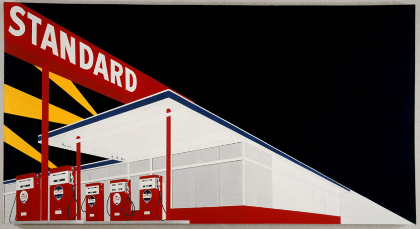
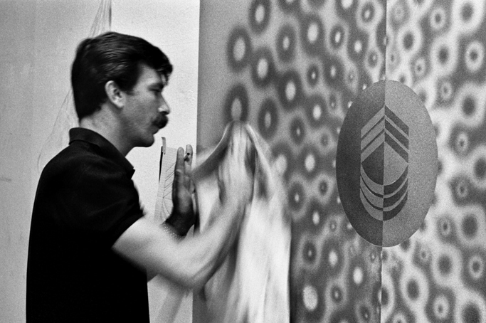
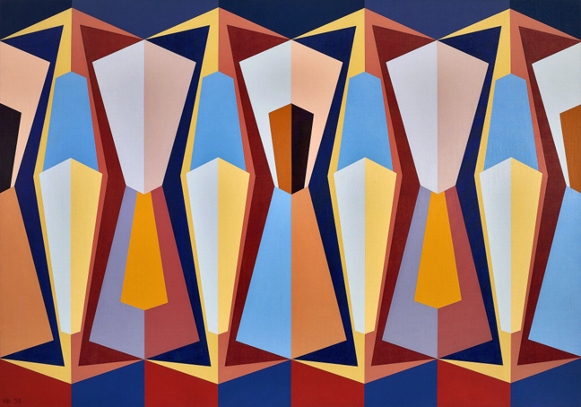
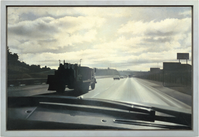
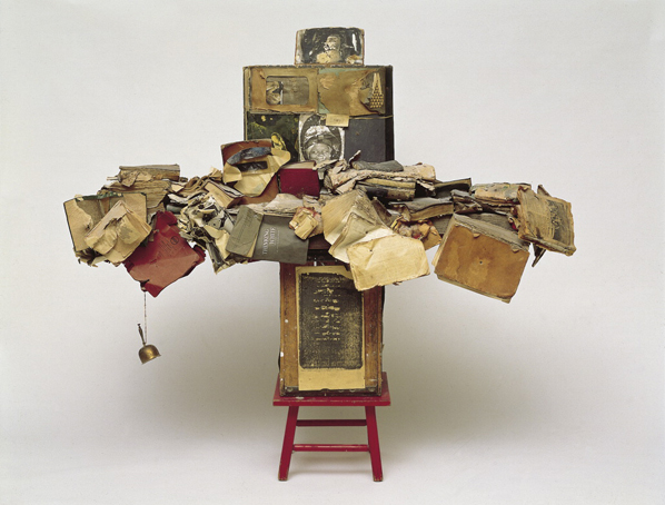
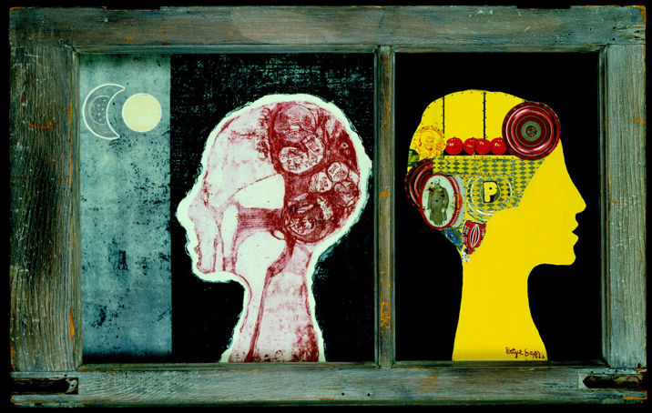
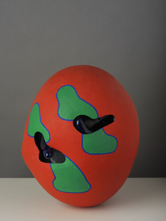
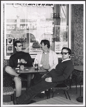
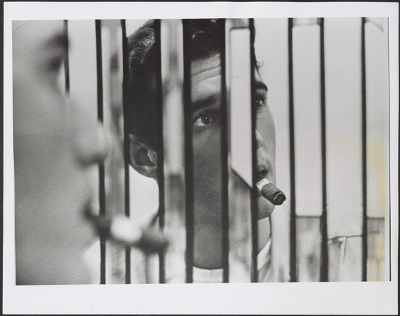
The culmination of a nine-year research initiative organized by the Getty Research Institute, Pacific Standard Time: Crosscurrents in L.A. Paintings and Sculpture presents a focused examination of painting and sculpture produced in Southern California from the late 1940s to the early 1970s. Drawing from archival collections acquired by the Getty and sources that have become newly accessible as a result of the initiative, the exhibition will offer a fundamental reappraisal and reinterpretation of postwar Los Angeles art. The exhibition will feature nearly 50 artists and will include multiple works from each, on loan from preeminent national and international collections, allowing visitors to get a sense of the distinctiveness of individual practices as well as the place of Southern California artists within broader historical movements. This exhibition is co-organized by the Getty Research Institute and the J. Paul Getty Museum and will travel to the Martin-Gropius-Bau, Berlin in the spring of 2012.
10/01/2011 02/05/2012
The Getty Center
1200 Getty Center Drive
Los Angeles, CA 90049